BLACK, WHITE, and GRAYS
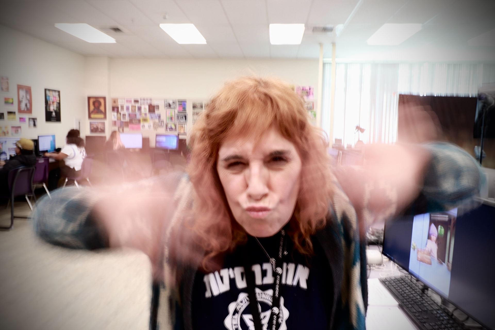
- Teacher
- Sanitization
- Watch face
- Lego Circa 1900
- Dark Forest Green
- Teddy’s Thoughts Depressing
- Behind Bars
- SunSet
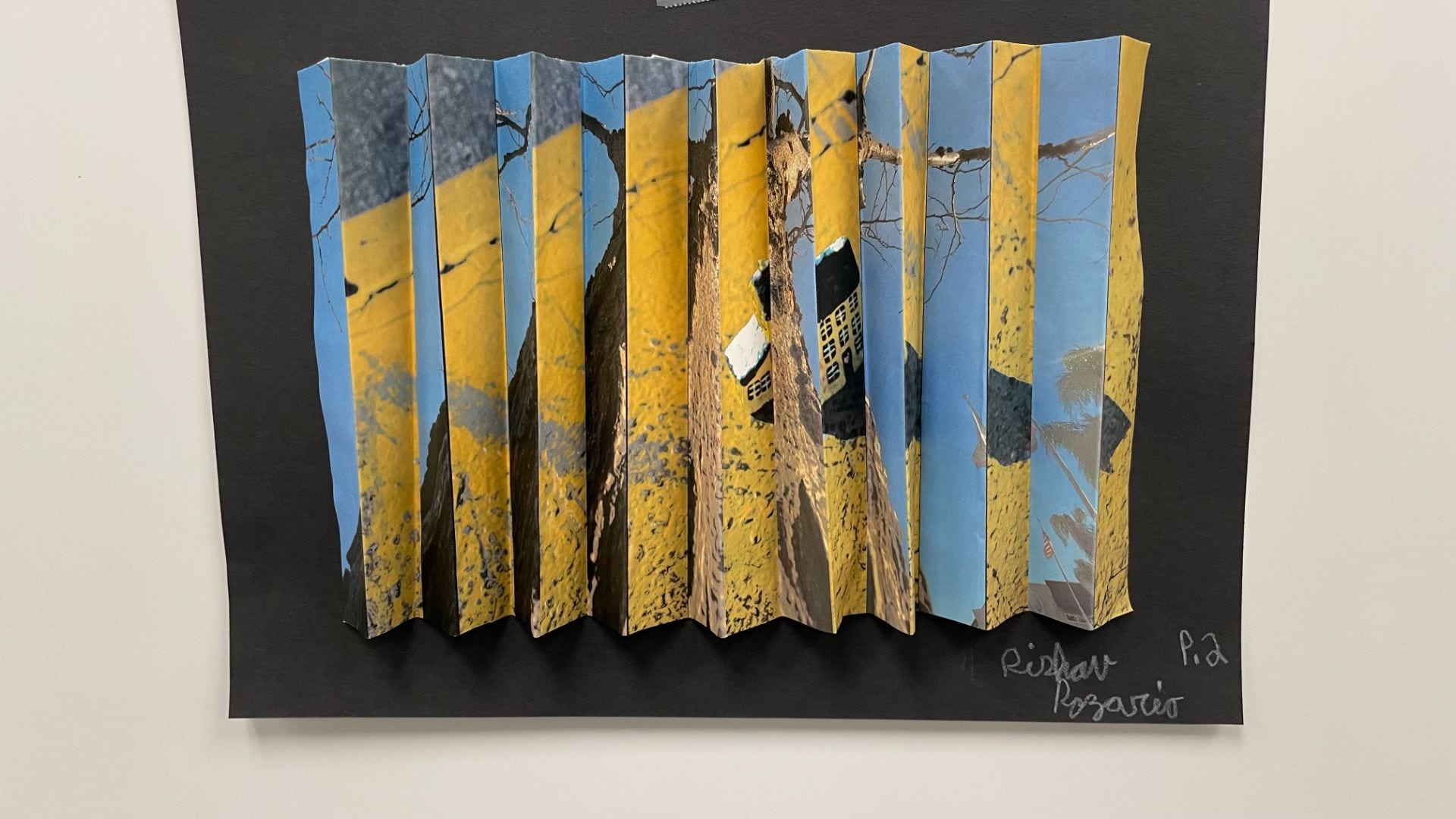
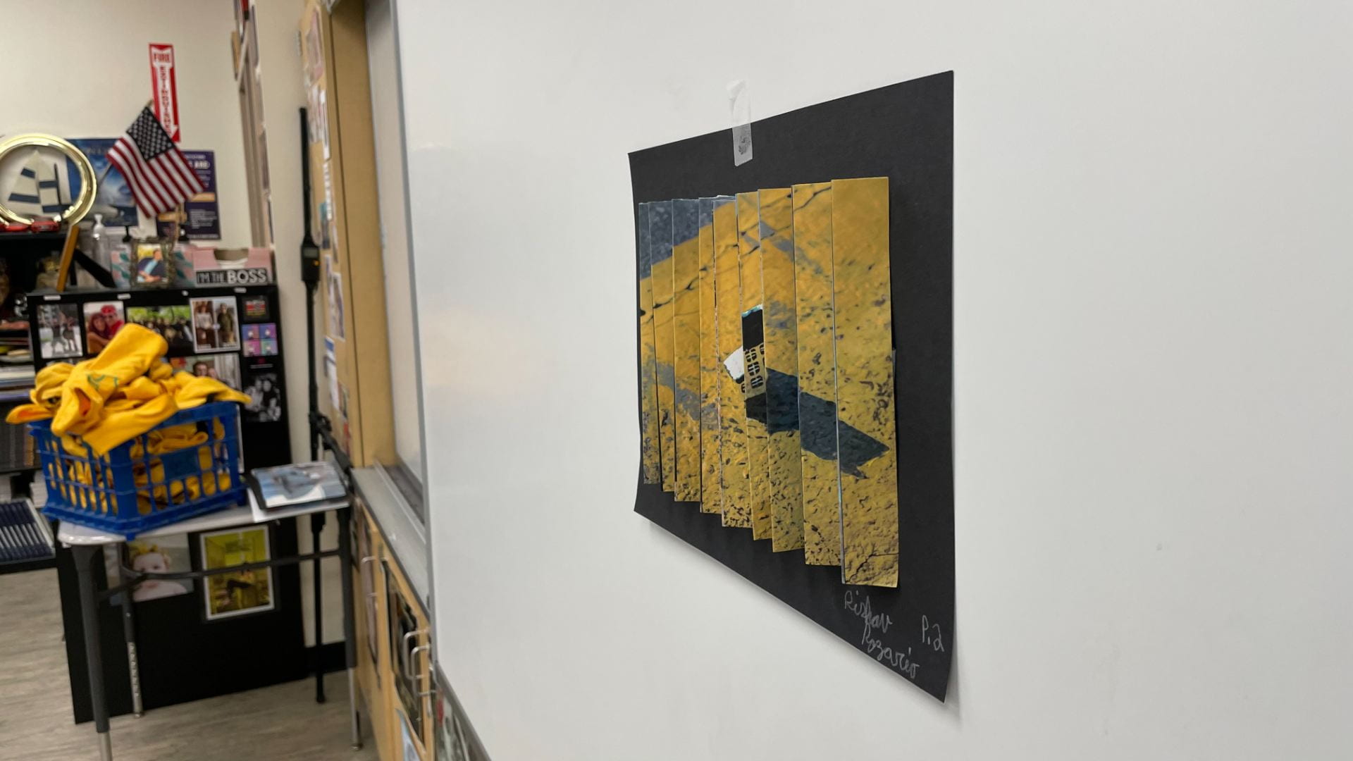
Kinoptic Art – Tree House
OREO
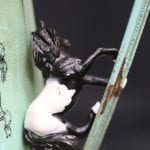
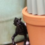
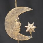
HORSE STORY – Moon, Dune, Doom (Mar.16,2023)
- There once was a Horse who lived on the Moon.
- He slipped and he thought he’ll fall to his doom.
- However, he ended up landing in a plant….
- Will he get back to the moon? sadly he can’t.
- He explored the plant to its core..
- He couldn’t fly back because he was just a Hor…se.
- The plant he is in is 179 years old….
- The idea to leave it and venture more is very bold.
- He leapt out of the plant, and he badly fell…….
- He couldn’t get back up to the plant, “Darn it! HELLLL”….
- The only option was to go find a new home….. he was now all alone.
- “What’s that?????”
- “A Cactus?”
- “With A delicious Golden Flower!”
- He was too short to get up to it and eat…
- He circled and ventured further, in defeat….
- But…. Then he spotted in the something in the sky…. It was the MOON!
- but…..
- The horse got hit by a car.
- R.I.P 20 20 three.
JHHS Photography Logo Proposal
My Artist Statement
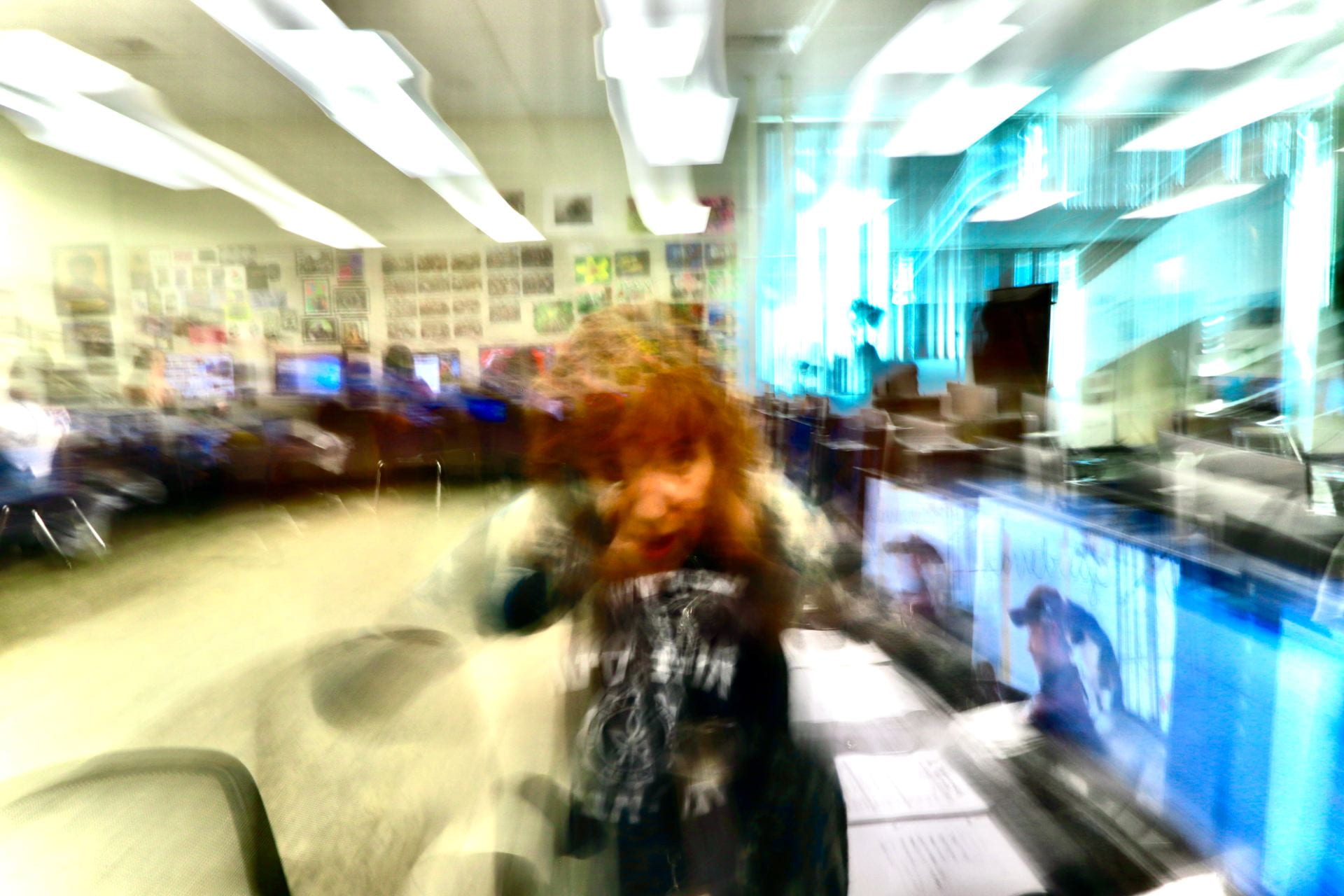
Motion Blur
Shape and Form
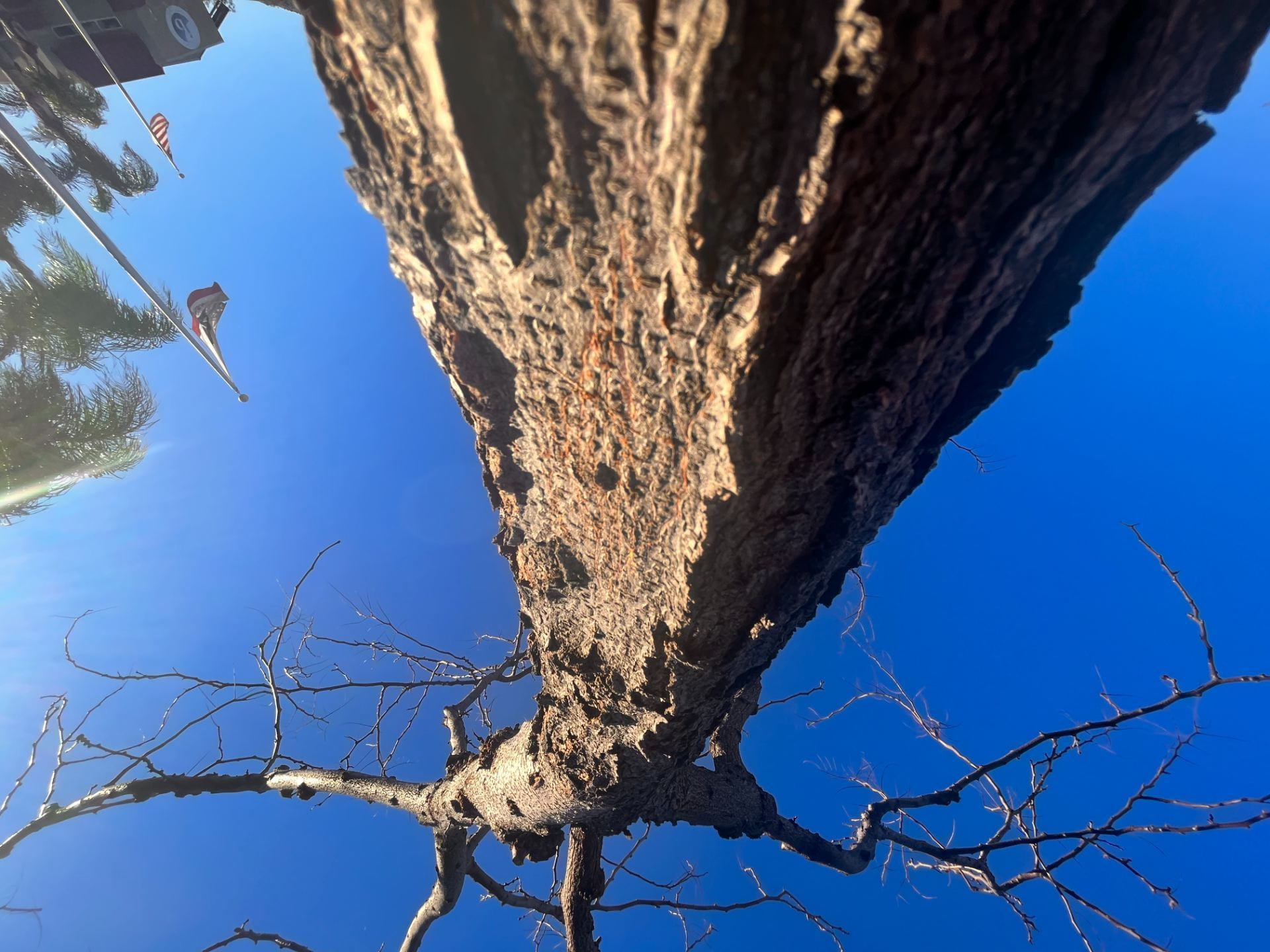
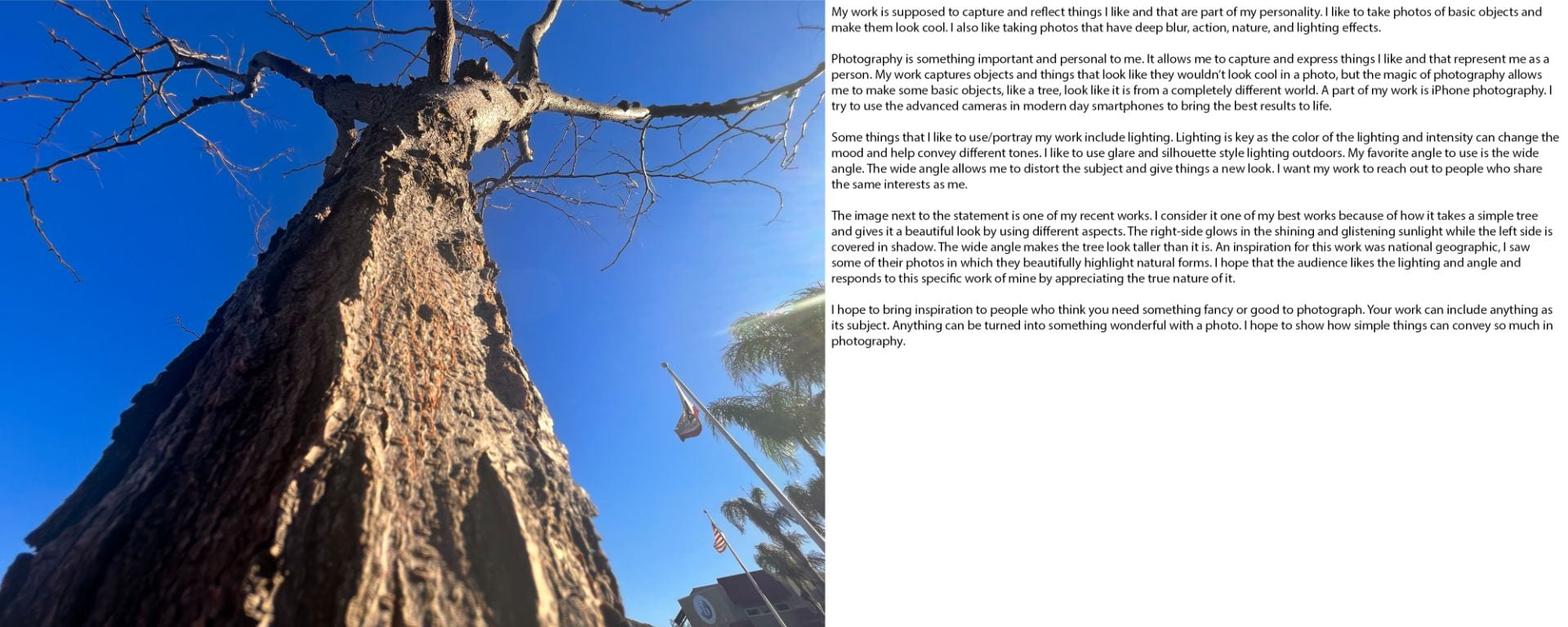
The work is successful at showing the form of the tree from the texture to the shape of the branches. The background makes the shape and form of the branches stand out. The lighting on the trunk contributes further. The image is also upside down to get the attention of the viewer and see this new perspective. A criterion I would list to judge these two photos is focus, the lighting, the colors, and the background. The work makes me feel like I’m in a similar but new and strange world. This is because of the upside-down image and the angle from which the tree is photographed in the wide angle.
Favorite Keith Haring Artwork
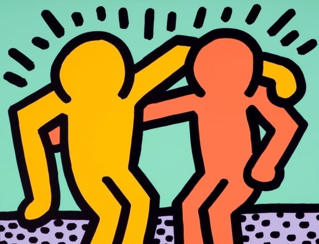
This Keith Haring artwork is my favorite because of its simplicity and message. I think it promotes friendship and living in peace. I think he intended to say that people should all be friends and not fight. The image shows one figure with its arms around the other, symbolizing friendship. I also like it because it doesn’t have too many things, its simple and still manages to portray its message.


